Search for an answer or browse help topics

The various types of charts available in Alpha Trader are:
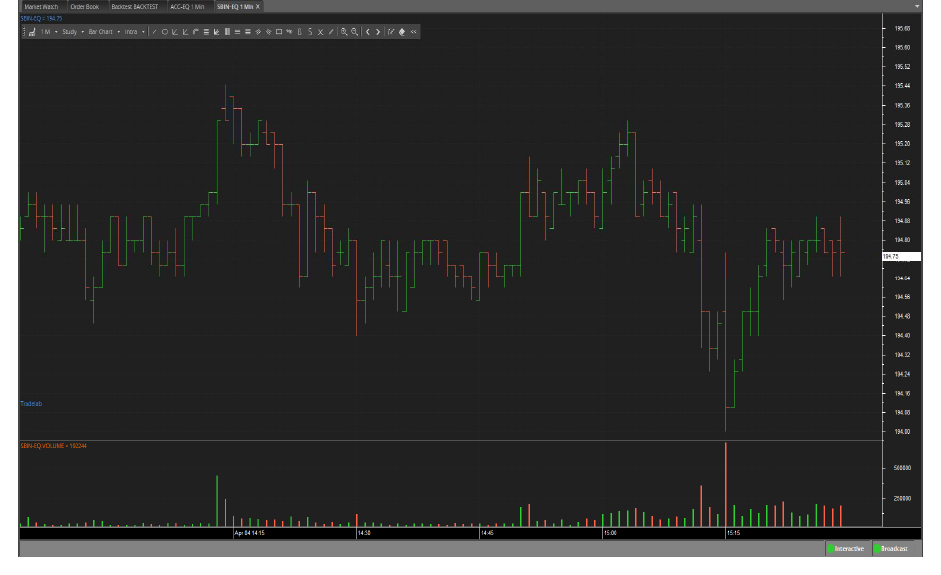
Bar Chart
This chart type is the most common way to display data for analysis. Open, high, low, and close prices are shown for the time increment represented by the bar.

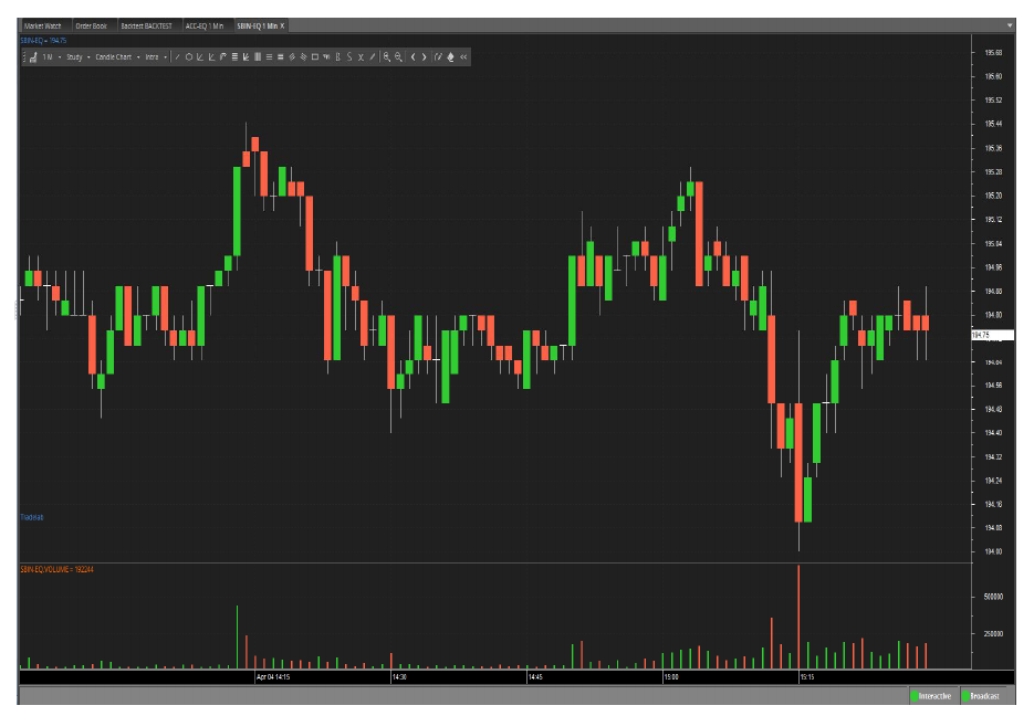
This chart type uses the same price data as regular bar charts, with each candlestick representing the open, high, low, and close. The thick part, called the real body, represents the range between the opening and closing prices. Long thin lines, shadows, and wicks/tails represent the range of price movement for the bar.

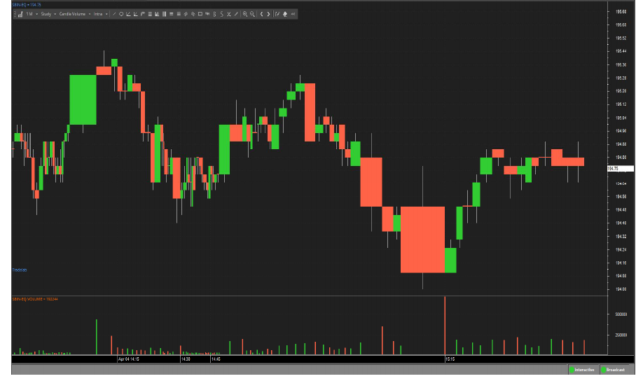
Candle Volume
As its name implies, Candle Volume charts merge volume into candlesticks. This allows chartists to analyze both price action and volume with one look at the price chart. It shows candle ticks are used to see the open and close for each period, as well as the high and the low.

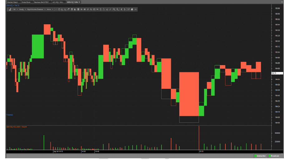
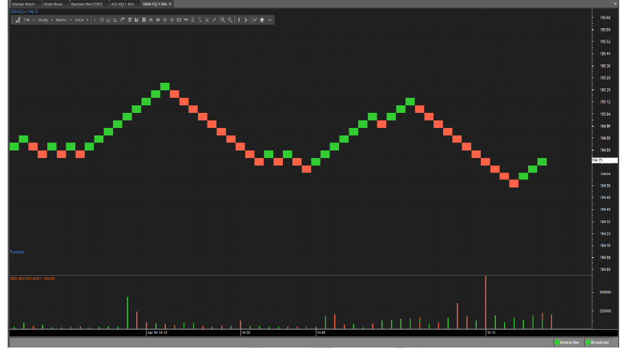
Equi Volume
Equi Volume is a price plot that incorporates volume into each period. Equi Volume charts look similar to candlestick charts, but the candle ticks are replaced with Equi Volume boxes that can be square or rectangular.

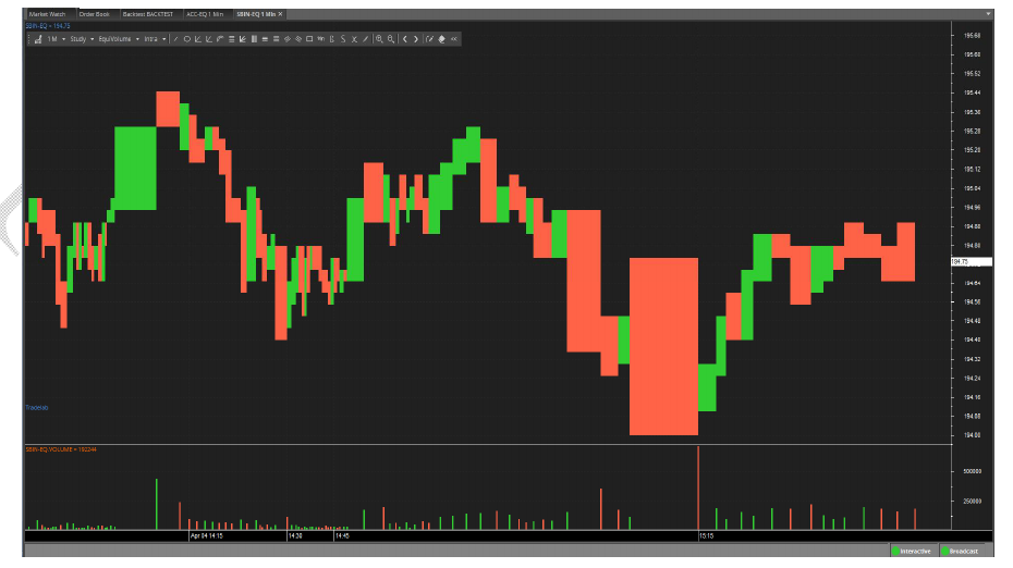
Equi volume shadow measures the relationship between price, volume, and shadow. Price is measured on the vertical axis and volume is measured on the horizontal axis. It combines price and volume in a two-dimensional box. The top line of the box is high for the period and the bottom line is the low for the period. The width of the box represents the volume for the period. The shadow (an empty region in the box) is based on the difference between open and either high or low depending on whether the price closed lower than the open of higher than the open for that interval bar.

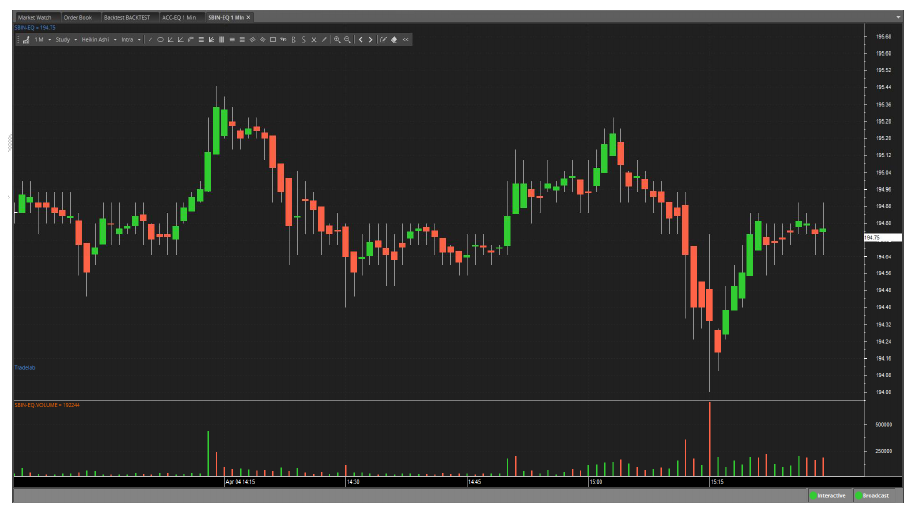
Heiken-Ashi means “average bar” in Japanese. Open, high, low, and close prices of HA candle ticks are not actual prices, they are results from averaging values of the previous bar, which helps eliminate random volatility.

This chart type looks like a continuous line that changes directions and switches from thin to bold. The direction changes when the price changes beyond a predefined amount, and the line switches between thin and bold if the last change bypassed the last horizontal line.

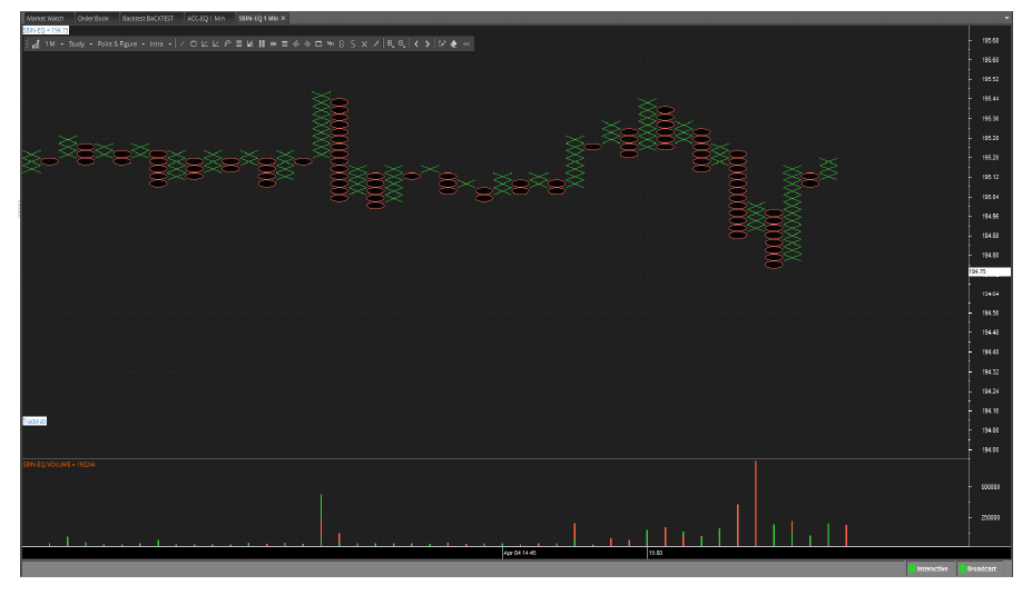
This chart type only plots price movements, without taking time into consideration. A column of X’s is plotted as the price rises—and O’s as the price drops.

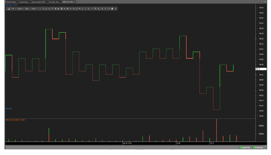
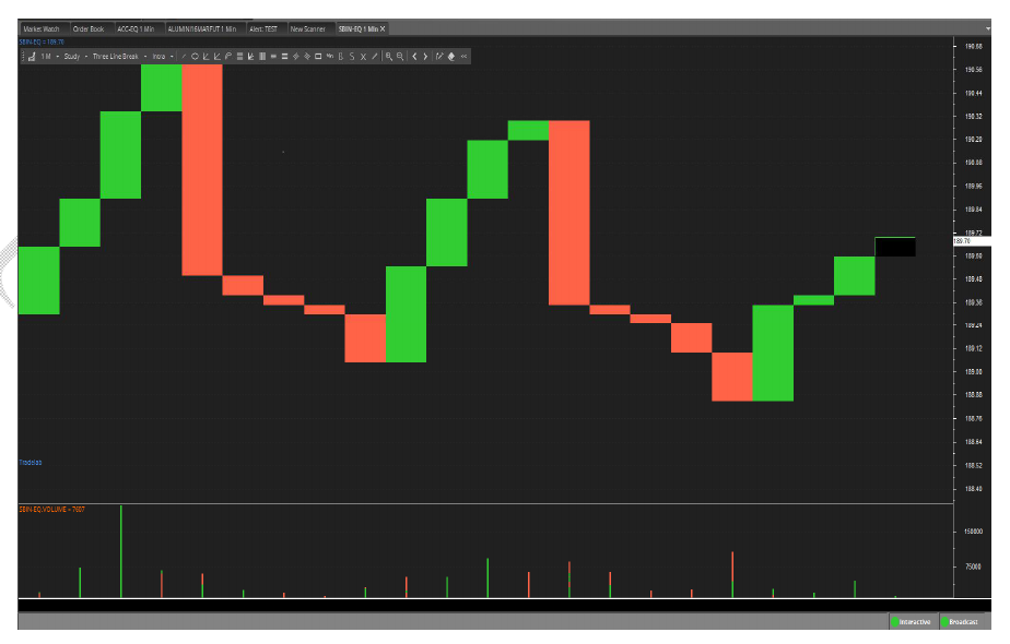
This chart type only plots price movements, without taking time or volume into consideration. It is constructed from ticks and looks like bricks stacked in adjacent columns. A new brick is drawn after the price passes the top or bottom of the previously predefined amount.
This chart type only plots price movements, without taking time or volume into consideration. This chart type displays a series of vertical boxes that are based on price changes.


Simply fill the details, connect your bank account & upload your documents.
Open An AccountYou will be redirected in a few seconds.